The visualisations shown here were all created for different scientific publications throughout the years, and the majority of them are published in journals except the final one. If you would like to use any of these figures somewhere or if you just want more information, I'm happy to help; see my LinkedIn profile about how to contact me (link at the bottom).
- Map of the Arabian Gulf
- Weather station
- Mineralogy
- Relative sea level
- Submarine map of the Maldives archipelago
Map of the Arabian Gulf
Let's start with the type of figure a geoscientific paper typically starts with, a map, or three maps in this case. This particular figure was published in 2020 in the Journal "Sedimentology" (link), as part of an article about microbial mats.
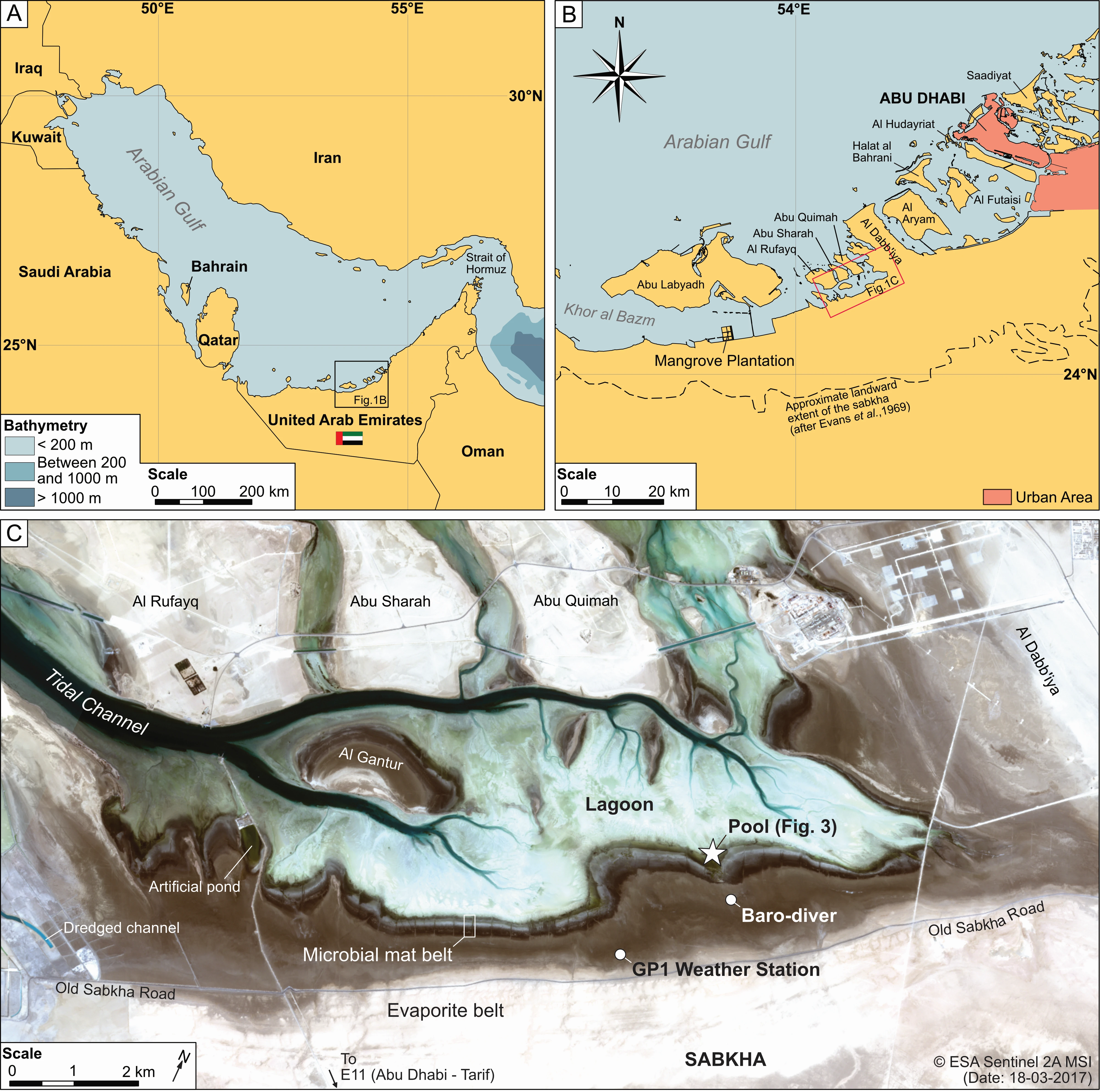
Part A of this figure shows an overview map of the Arabian Gulf. To its right is a similar map that shows a view closer to the study area. The bottom map is based on satellite imagery (Sentinel 2A data), and shows a close-up of the study area, with sample locations marked, and some features marked. Tools used: QGIS, Affinity Designer. Data source: naturalearthdata.com.
Weather station
The next figure visualises weather data recorded by a mobile weather station, which was installed in a coastal area of the Emirate of Abu Dhabi between 2016 and 2017. It also shows data from a water height logger installed in the same area.
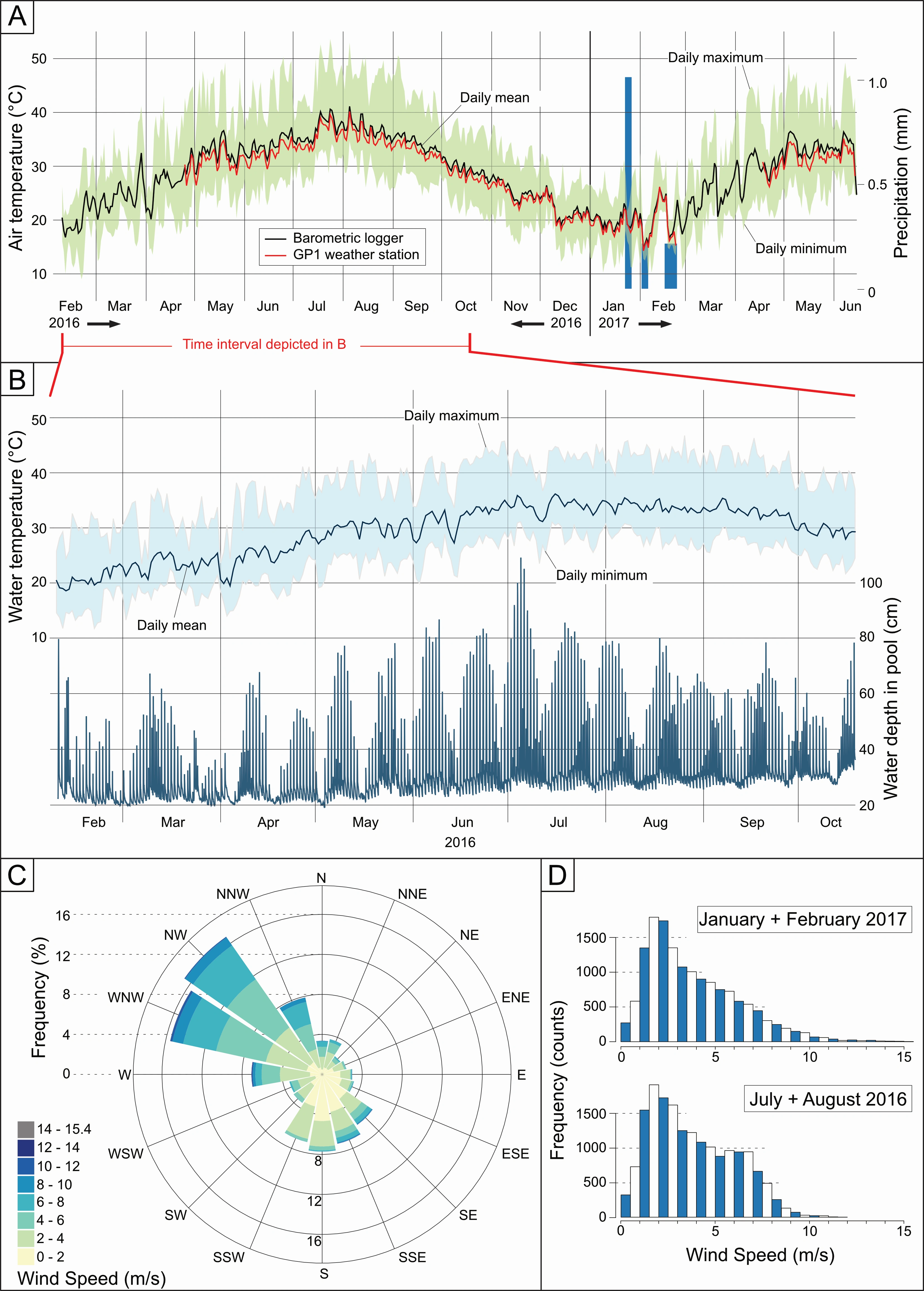
A - shows the variations of air temperature within almost a full year as well as precipitation events during the winter months. B - shows variations in sea water temperature as well as tidal height as a function of water height in a pond. C - shows a windrose and visualises the directions from which the wind blew over the logging period (~NW in this case). D - shows the frequencies of specific wind speeds, split into winter and summer months.
Mineralogy
The next graph is a figure typical in geoscienfic research articles: it contains rocks as well as the results of mineralogical measurements on these rocks. It was published in 2017 in the Journal of Sedimentary Geology (Link).
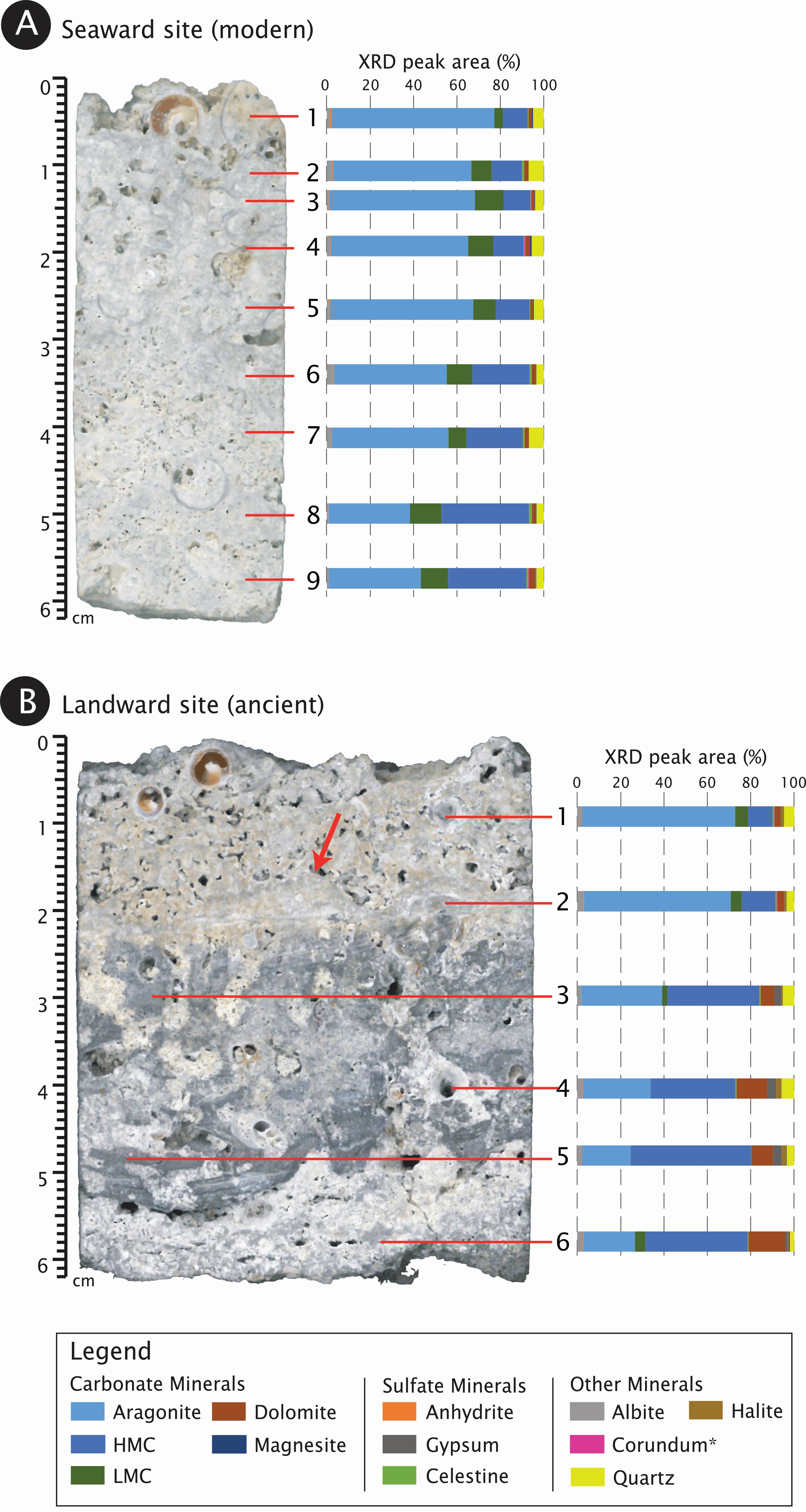
Both A and B show similar things: on the left is the scan of hand-speciment of rocks, on the left the mineralogical composition based on X-ray diffractometry measurements. The legend at the bottom defines what each color means. Results like these can be read from bottom to top or top to bottom, depending on the intended goal (ideally it should be interpreted from both directions). When read from the bottom to the top (=stratigraphically), changes in the mineralogical composition a likely the result of changes in depositional environment; when read from top to bottom, changes in the mineralogical composition might instead be the result of chemical changes that happened long after deposition. Of course, nature is not always so linear, and top-bottom and bottom-top variations can mean different things entirely.
Relative sea level
From the same paper comes the next figure. It visualises how relative sea level has changed has a function of geologic time.
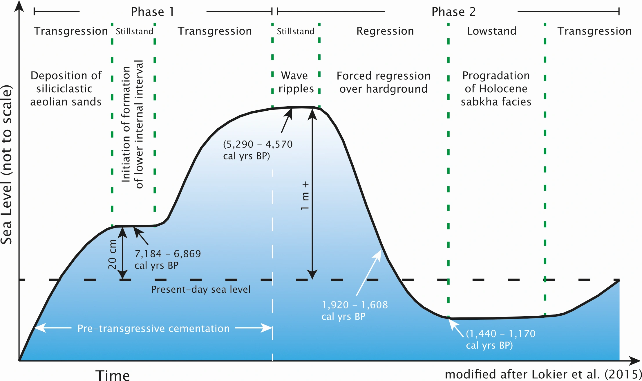
Time is on the x axis and sea level on the y axis. There are no specific values associated with each axis, as this is more of a conceptual thought experiment that based on numerical data (=a conceptual model). However, the relation of specific events associated with the study, as well as some concrete measurments such as carbon age are associted with relative changes in sea level.
Submarine map of the Maldives archipelago
The final image is not yet published (it hopefully will be soon). It shows a part of the Maldives archipelago, more specifically of the part that is usually covered by the ocean. It also is a perspective view coming from the fact that this is actually a 3D model that can rotated and zoomed out off at will. The raw file can be explore on Sketchfab.
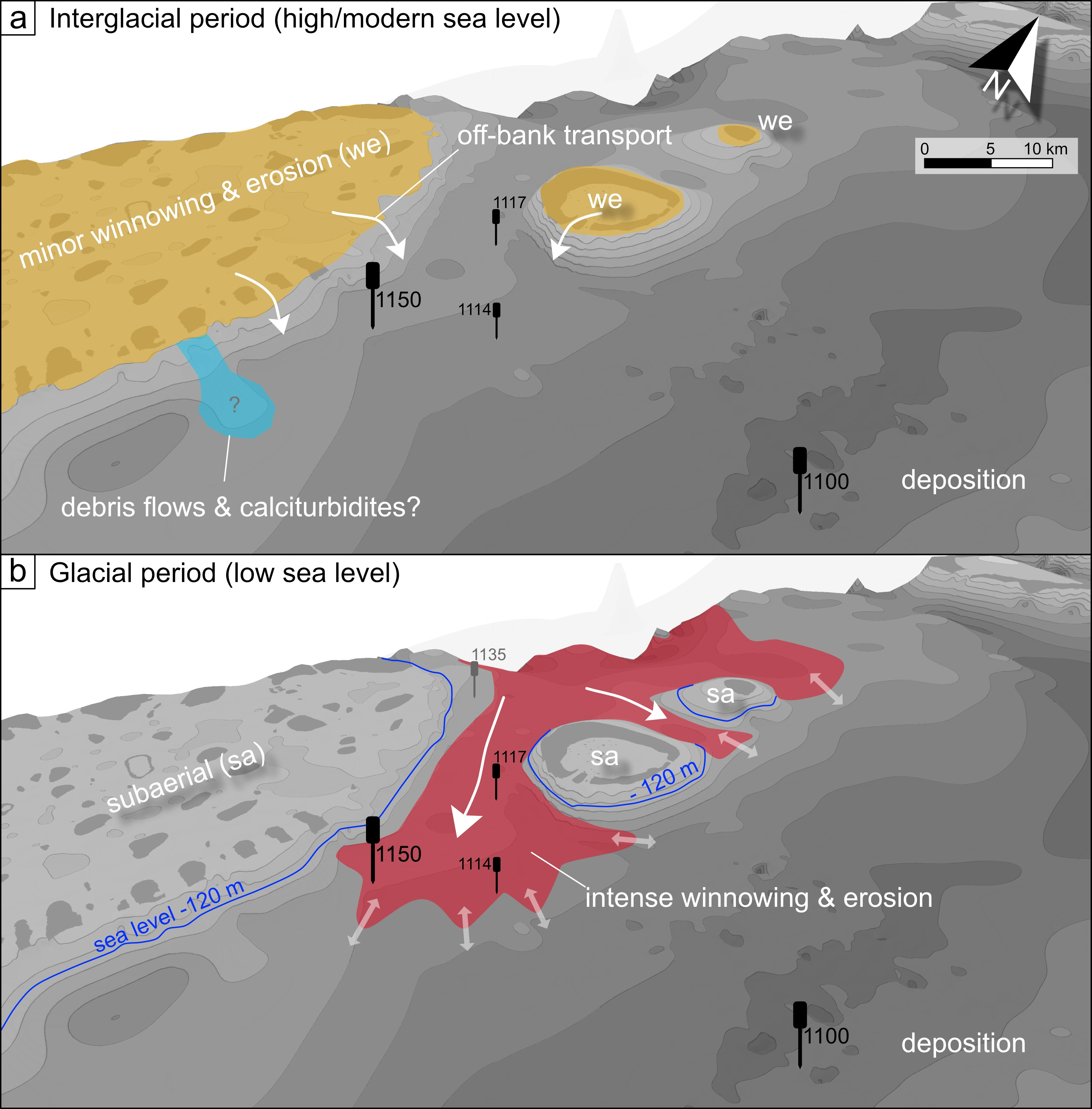
The upper section shows a model of how the Maldives are today, during what is called a sea-level highstand. All atolls are mostly covered by ocean water, and oceanic currents transport coral debris off the atolls into a basin in the center, the Inner Sea. The bottom sections shows the same area but during a sea level lowstand, like during a glacial period such as the last ice age. At this time, the atolls we know today were much larger, and all exposed to the air. In-between the major atolls, for example between what we know as Ari and Rasdhoo atolls today, strong currents transported sediments in and out of the inner sea.